the 0711 Audio logo consists of a hexagonal honeycomb shape with horizontal lines of varying lengths inside; the stylised representation of the Stuttgart TV tower within the logo creates a visual link to the company's location and anchors the brand regionally.


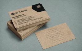
business card with unprocessed natural paper with a tactile front featuring the logo
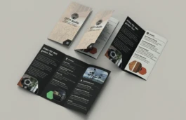
A brochure designed in accordance with the rules of the new developed CI
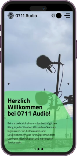
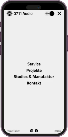
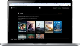
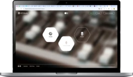
The overall visual appearance is minimalistic and modern. Clear lines, generous white space and a subtle, coordinated colour palette create a professional and high-quality impression. Uniform typography and consistent UI elements ensure intuitive operation and a compelling brand experience.
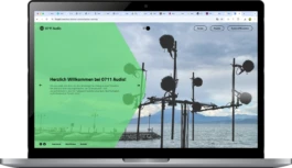
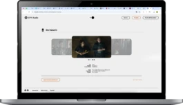
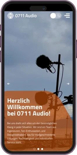
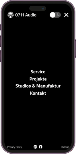
The minimalist design also emphasises professionalism. The design conveys seriousness and credibility by avoiding unnecessary visual distractions and instead using a clear visual hierarchy that makes it easy to navigate. All design elements are precisely coordinated to create a consistent brand identity and build trust among users.